Every single day of our ever busy, modern lives, we touch the end results of literally tens of thousands of designers – from the packaging that contains our favourite breakfast cereal right through to the super slim, smart TV screens that play us to sleep with yet another rerun of that late night film. From cars to carbon fibre golf clubs, from websites to web enabled central heating systems – design, both in function and form, are more often than not the major weighting factor when we chose to buy a particular product or indeed use a particular service.
This almost endless relationship with design aside, how would you rate the top three iconic designs of the last twenty years and why do you think they made it onto the list? To start you off, why don’t I give you my own personal favourites and maybe set you thinking about which iconic product designs you would rank in the world’s top three.
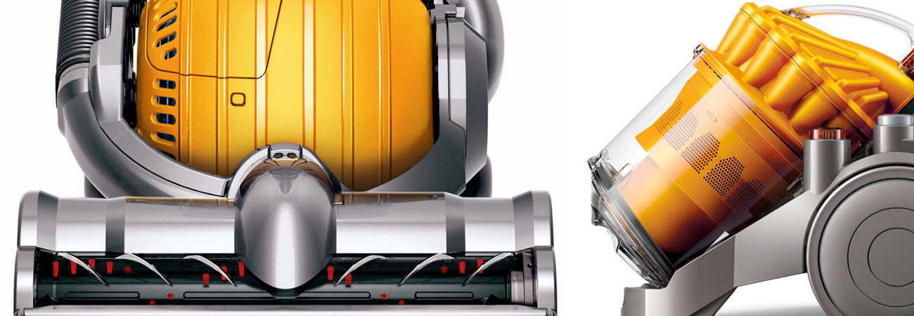
Having spent my earlier years in a surprisingly tech free world, I have to immediately recognise the design genius which went into perhaps the biggest change in consumer choice of the last fifty years – a household tool that placed design alongside function in front of the most critical, adult audience demographic in the world – the housewife. When I was growing up, the not so gentle hum of the humble vacuum cleaner was a constant soundtrack in my home. When not powered by electricity, we even had a roll along cleaner – the “Ewbank” to ‘do the hoovering’ every day. Even the very verb was based on a brand name- Hoover- and no one cared what they looked like as long as they sucked (lol).

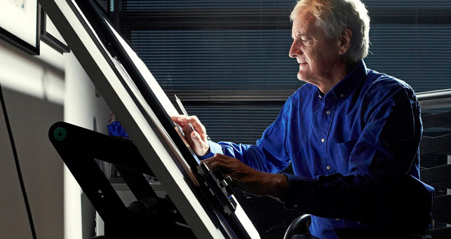
Today, a market leader is as design led as it is technically advanced, with housewives making the choice on the basis of colour and fashion whilst paying a premium for the privilege. Of course my number one place goes to that genius from our tiny island, Sir Charles Dyson. His design skill, alongside a search for technical innovation, has seen his range of rather expensive ‘hoovers’ soar in popularity alongside amazingly imagineered products such as the Airblade and the AirMuliplier fan. In my humble opinion, Charles Dyson really shifted the emphasis from function to form in a very crowded consumer marketplace and inspired a whole generation of product designers through his boldness and ability to innovate.
My second choice also includes a Brit at the heart of the design team (no apologies)! Leading the company’s design team since 1996, Sir Jonathan Paul Ive, KBE has been recognised not only as one of the leading product designers of the century, but also has played a key role in the design of Apple’s Human Interface Software program. As I sit typing into my MacBook Pro, I also notice that Ive was responsible for the iMac, iPod, iPad, iPhone and iWatch and a key player in the development of IOS, together with Scott Forstall. As Chief Design Officer of Apple, with a KBE awarded for services to design and enterprise, this private and unassuming individual really swept the competition aside in 2013, by being awarded the ultimate accolade – a Gold Blue Peter Badge! With over 5,000 patents registered by Ive, I wait with baited breath for his next arrival.

Finally, and just a tiny touch outside the 20 years, is one of my personal favourites for it’s cheek, persistence and simplicity. With the concept and design by Michael Boehm, from Illinois (i.e. not another Brit!!!), this super and not unattractive kitchen essential was designed as an indoor grill with fat draining properties but initially wasn’t taken seriously for years until pitched to George Foreman through his agent. Immediately seen as a winner, George endorsed the ‘Lean Mean Fat Reducing Machine’, which has sold over 100 million units and earned George an estimated $200 million, which is far more than he earned as a world champion!

Why do I like it? It’s simple, labour saving and looks very manly in my kitchen. Actually, I do think the design is pretty cool and would never buy the Hulk Hogan/Jackie Chan/Evander Holyfield/Carl Lewis for one simple reason – it’s the very inclusion of George Foreman in the design criteria that makes it outsell its competition by a country mile – after all it’s “So good I put my name on it”. Remove the Apple logo from the iPhone and see the impact of incomplete design. For most consumers, design-lead product choice needs form, function AND branding to really work in the marketplace.
Which design icons would you vouch for? I’d be interested to see your list!
Congratulations to BWFC, promoted in season 16-17
Are You Ready to Blaze an eCommerce Trail with Magento 2.0?
A brief history and meaning of Lorem Ipsum
Iconic Design Part Three – Gurus or guerrillas? You decide!
Iconic Design Part One – Don’t let the apple fall too far from the tree!
How to create great content – what everyone should know
Brandstanding – How to get your brand talking to it’s target audience
-
Congratulations to BWFC, promoted in season 16-17
Bolton Wanderers will play Sky Bet Championship football next season after easing to a convincing 3-0 victory over Peterborough United on Sunday lunchtime and securing second place in the process. Our infographic gives a brief overview of the stats for season 2016-2018. Congratulations to all the staff, team and fans at BWFC Twitter LinkedIn Google+ Read More
-
Are You Ready to Blaze an eCommerce Trail with Magento 2.0?
With over a quarter of a million online shops on the Magento platform it is fair to say that the market has grabbed the functionality and flexibility of Magento 1.x with a great deal of enthusiasm and in many cases worked around any functional constraints ‘without concern’ (albeit with some fancy API and developer budgetary Read More
-
A brief history and meaning of Lorem Ipsum
I wonder how many of you, with time on your hands, ever tried to cast you minds back to the good old days of school and tried your hardest to translate the most common text in the history of web and graphic design. You may have struggled with the conjugation of the verbs, the nature Read More